For this project, I had the objective to create my logo branding. The name couldn’t exist in other brands and had to be unique. The logo must be able to work in black and white and many other colors and once is done I had to make three mockups of objects that you would see in the store.
My Company
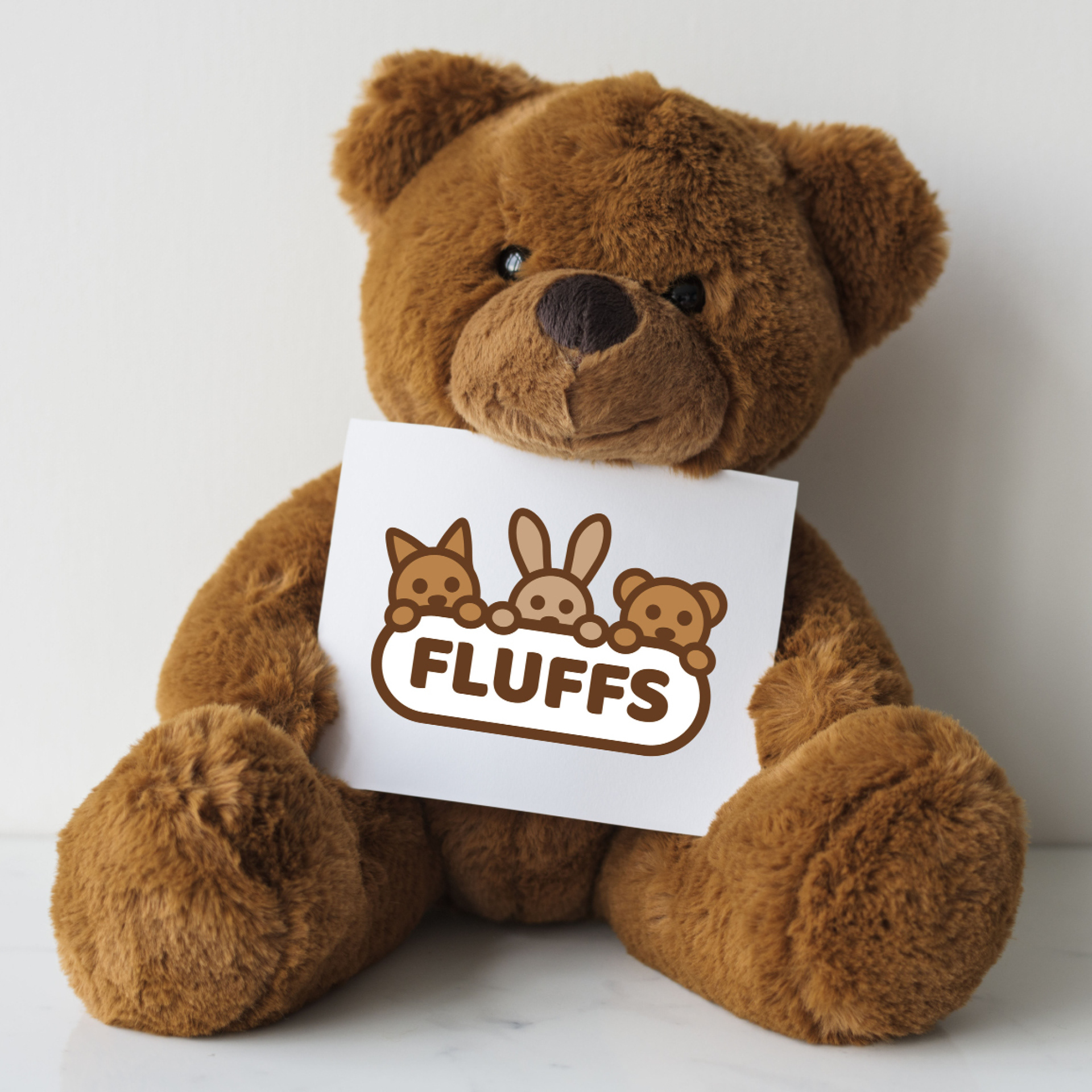
My brand is called Fluffs, a toy company that creates mascot-like plushies, to teach the kids how they should take care of the plushes to develop a caring experience in their early years. The main audience for these toys is kids between the ages of five to eight. Kids will learn to emphasize the importance of caring for their plushies, this will help children develop emotional intelligence and empathy from a young age. My company distinguishes itself through its mascot-like plushies, my branding approach creates a stronger emotional connection with young consumers, making Fluffs more memorable and desirable compared to generic plush toy brands.
Research
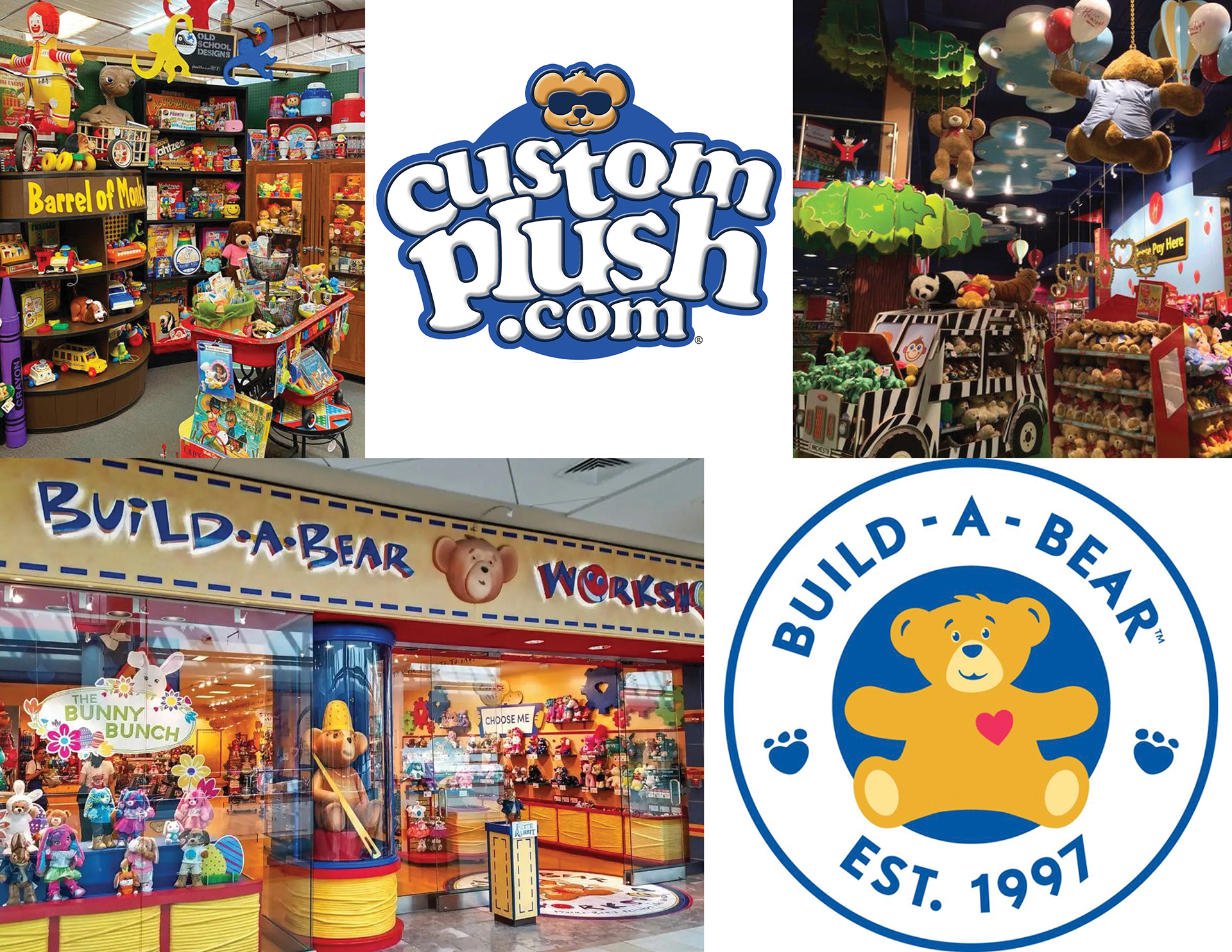
Build-A-Bear Workshop served as a strong inspiration for Fluffs due to its innovative approach to the toy industry and its emphasis on interactive, customizable experiences. Like Build-A-Bear, Fluffs aims to create a memorable and personal connection between children and their toys by allowing them to learn how to take care of them.
Moodboard created while doing research
Branding Names
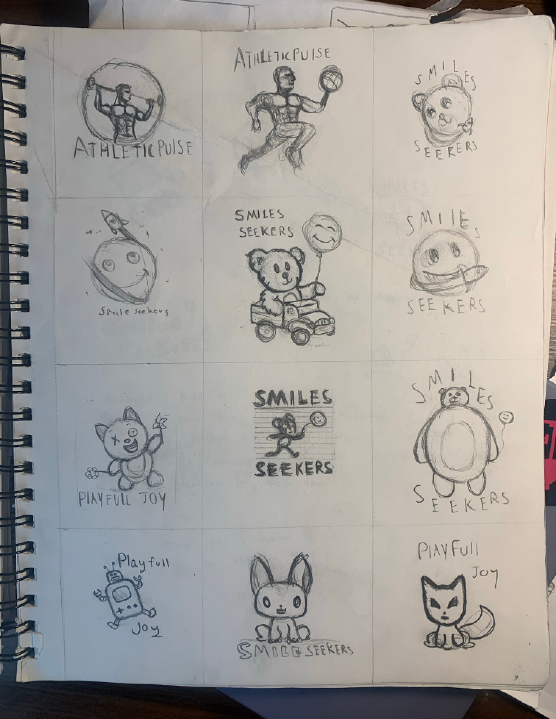
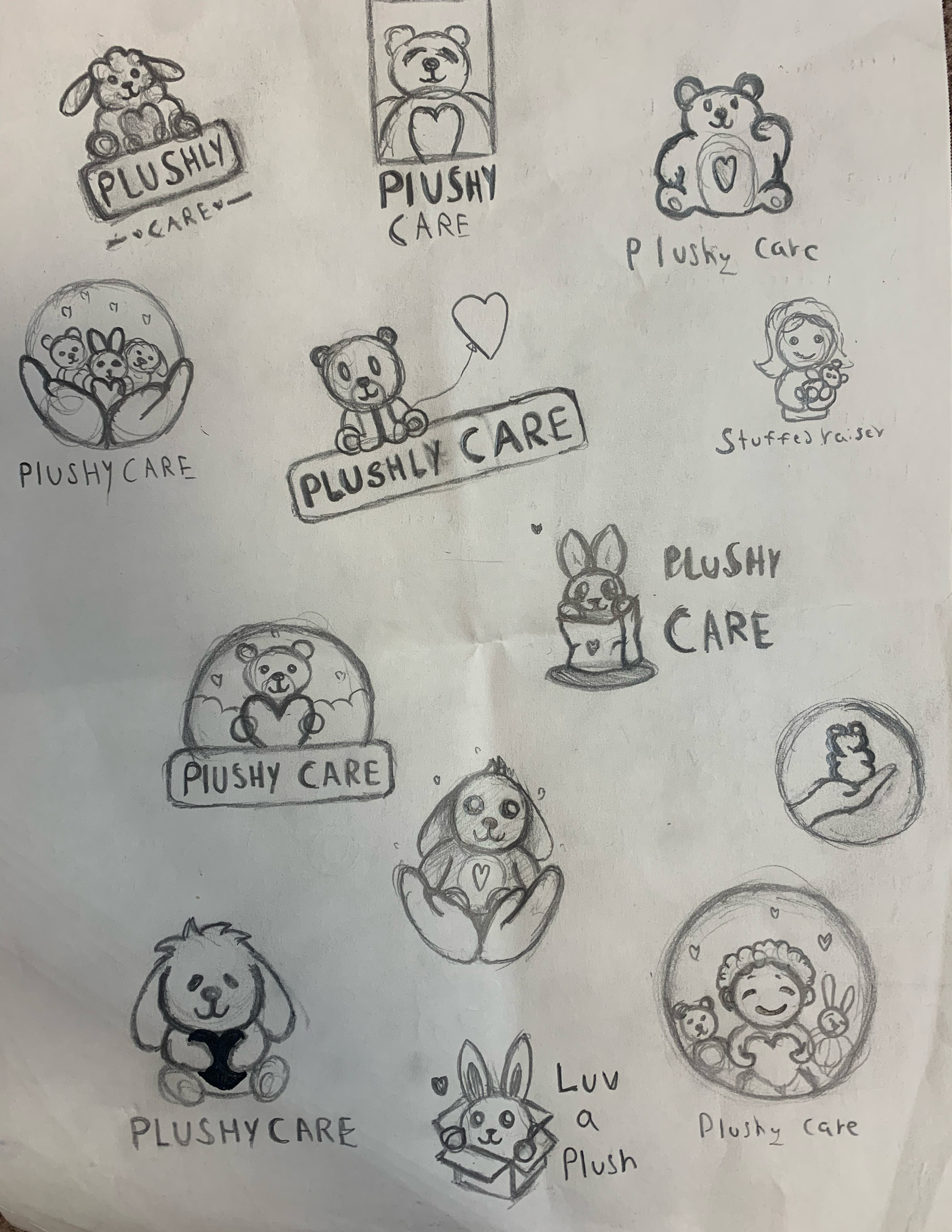
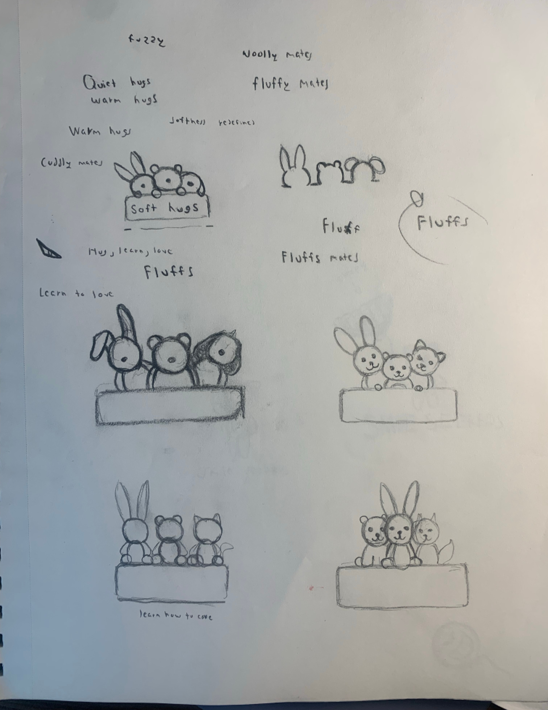
There are many known plush companies from “Build a Bear” to “Jelly Cat”, so it was really hard to come up with a name that wasn’t used and that sounded cute. I had many names during the sketching process that were strong choices for my brand name but they didn’t represent my company goal at all. Towards the end, I was going with plushy care but my professor, Lorrie Frear suggested doing “Fluffs” and that was the name I was looking for all of this time. Here you can find some of the old names I was originally thinking of using:
Playful Joy, smile seekers, wonder smiles, fluffy Care, warm hugs, cuddly Care, fluffy Mates, soul Pets, and stuffed raiser
Typeface Choice
Baloo 2 is the typeface for this logo and the reason for it is because it has a rounded and friendly appearance that can evoke a sense of warmth and approachability. This complements the cuddly and inviting nature of the plushies, aligning with the company name Fluffs. This company targets a very young audience of those with a calm and caring spirit, Baloo 2 can resonate well with them. Its whimsical charm can attract both children and adults who appreciate fun and creativity.
Sketches
I created many sketches during the process of coming up with both the name and logo, which was the hardest thing that I had to do in this project.

Digital Idealization

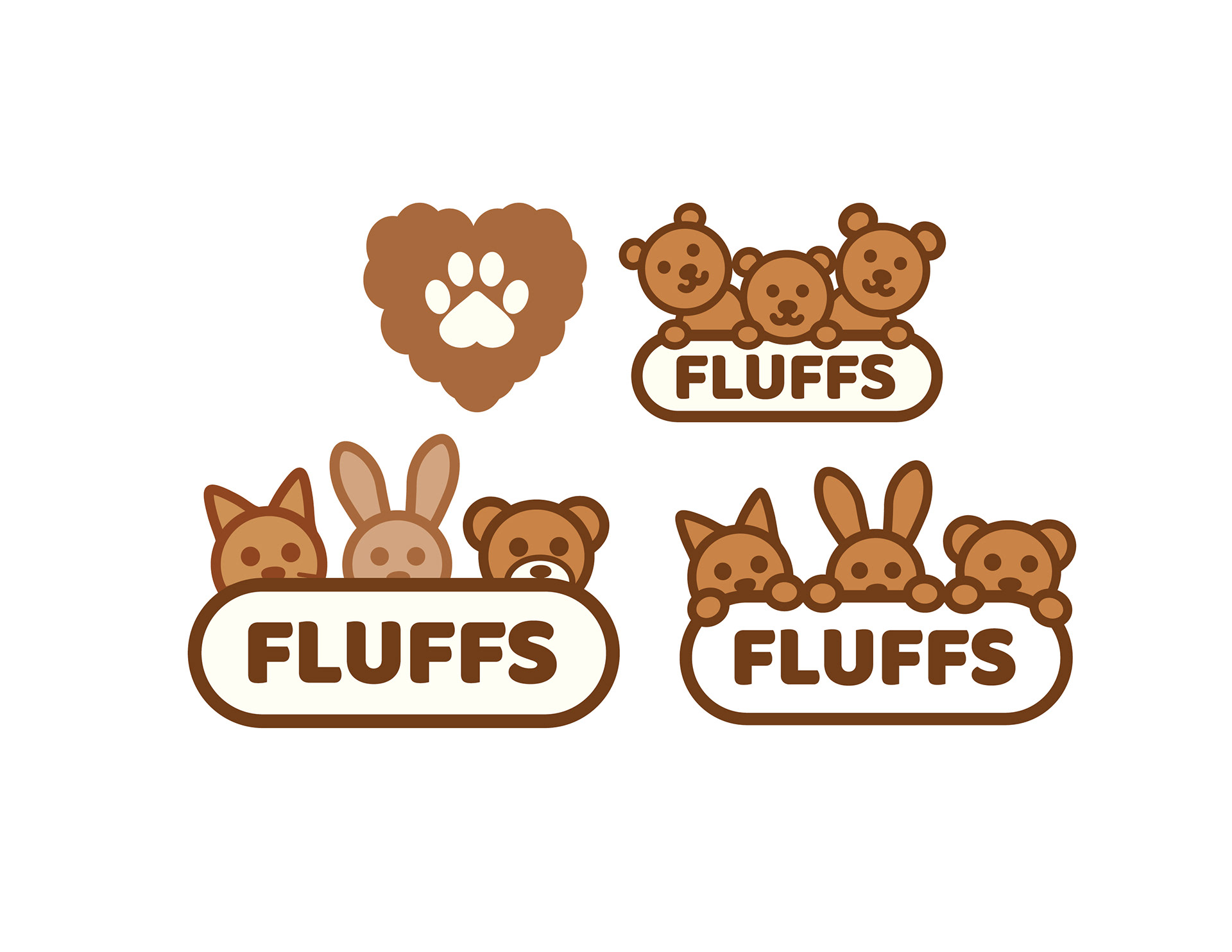
Colors
Brown color tones are often associated with earthiness and natural elements, evoking feelings of warmth and comfort. This aligns well with the idea of plush toys, which are often made to resemble animals and other natural objects. Brown tones, especially darker ones, can create a cozy and inviting atmosphere. This can evoke feelings of comfort and nostalgia, enhancing the emotional connection customers have with the brand and its products.
CMYK: 16%, 35%, 52%, 0% (light brown), 6%, 47%, 77%, 15% (brown), 35%, 75%, 100%, 41% (dark brown)
PMS: 728c (light brown), 7414c (brown), 732c (dark brown)
RGB: 214, 168, 129 (light brown), 202, 131, 70 (brown), 114, 59, 24 (dark brown)
Hex: D6A881 (light brown), CA8346 (brown), 723B18

Dark Brown

Brown

Light Brown
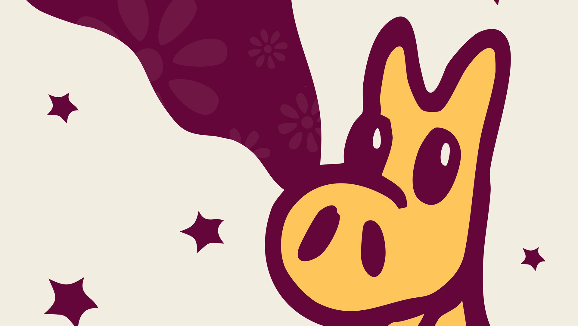
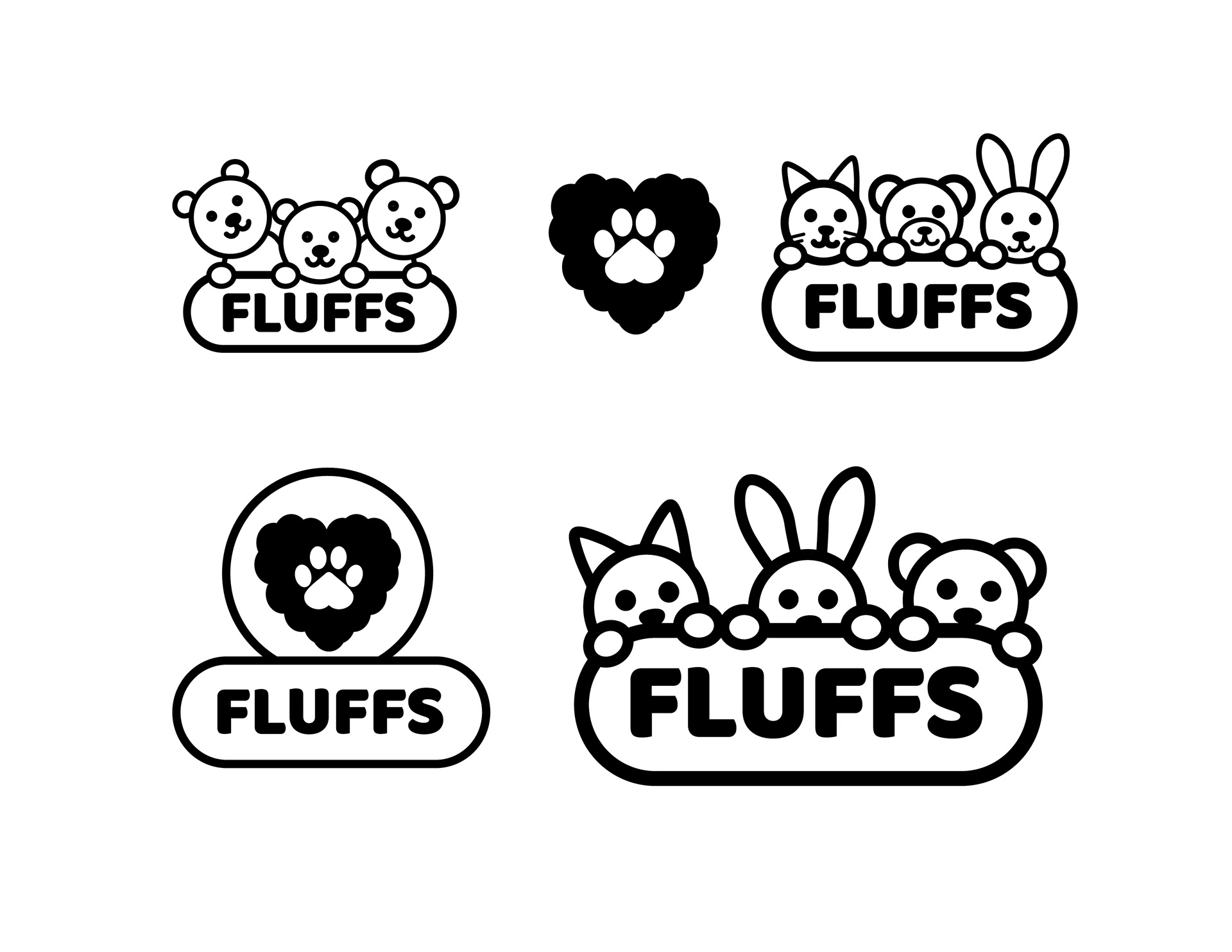
Final Logo Designs

Primary Logo

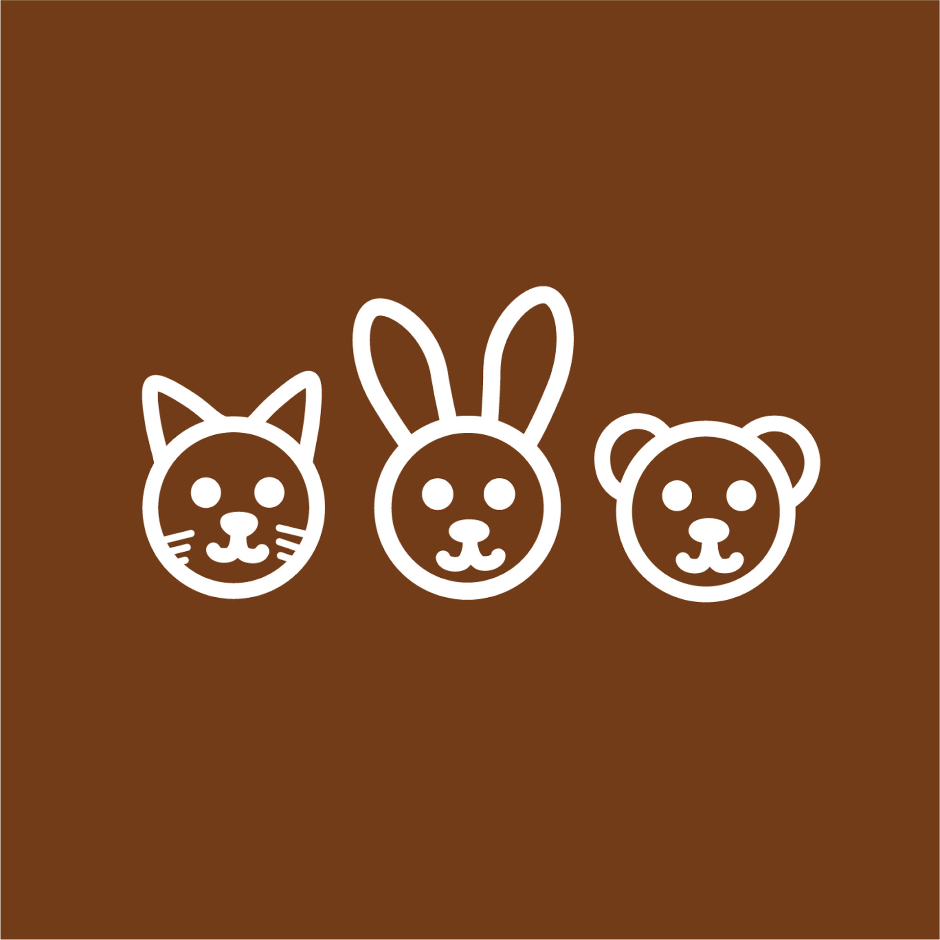
Icon

Logotype
Digital Icon

Reverse Primary Logo
Reverse Icon

Reverse Logotype

Reverse Digital Icon
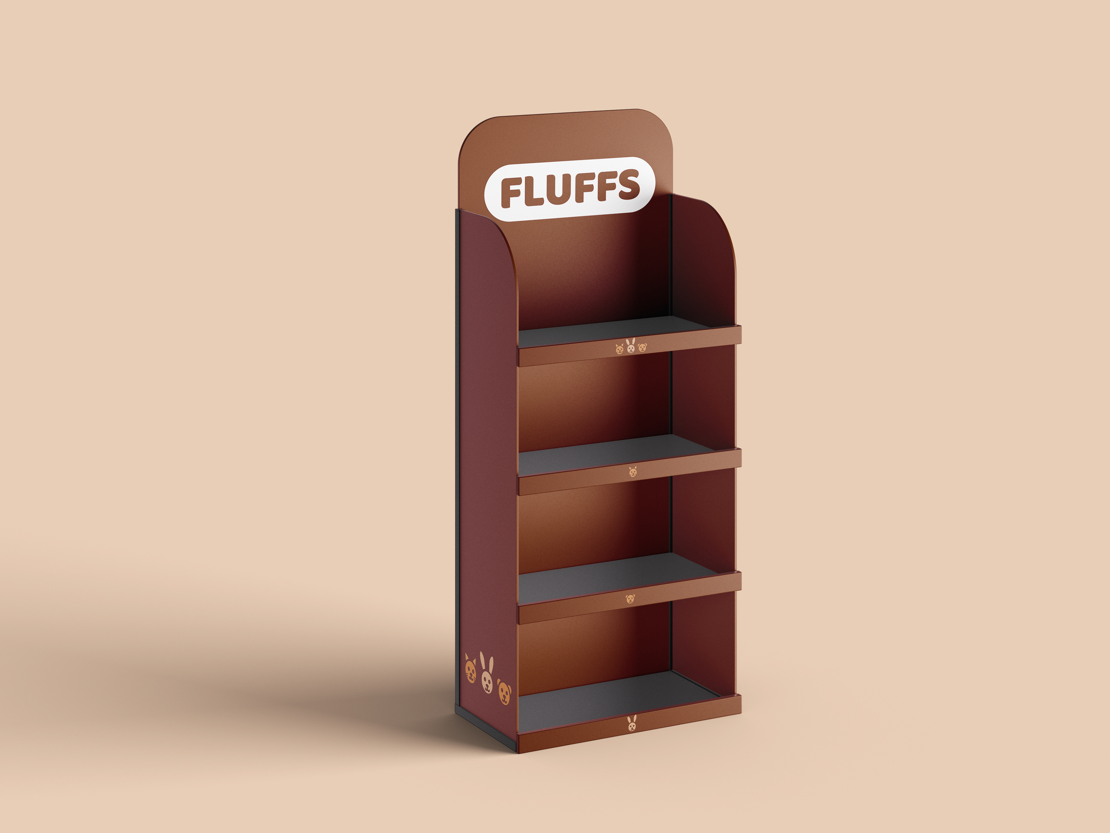
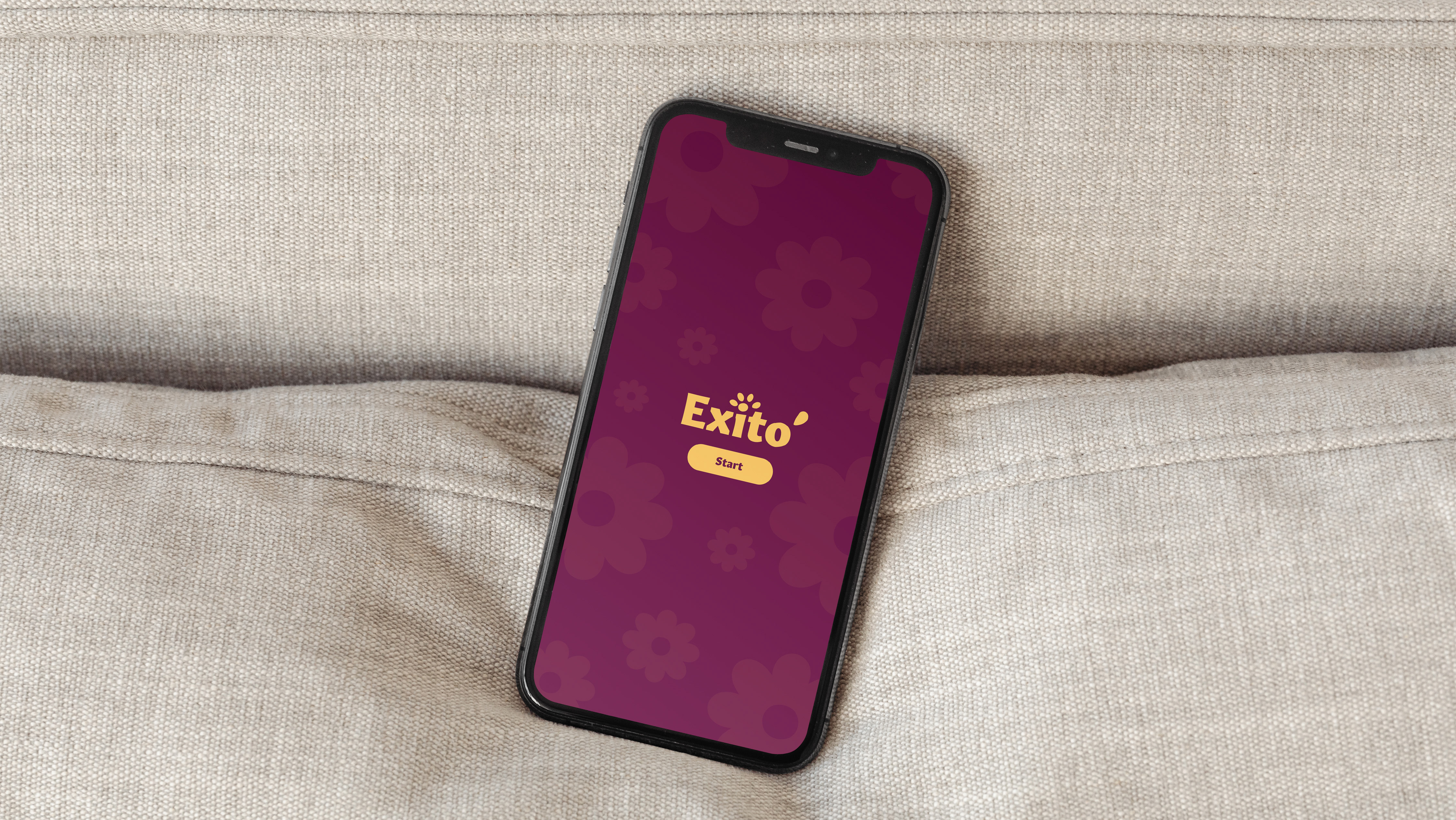
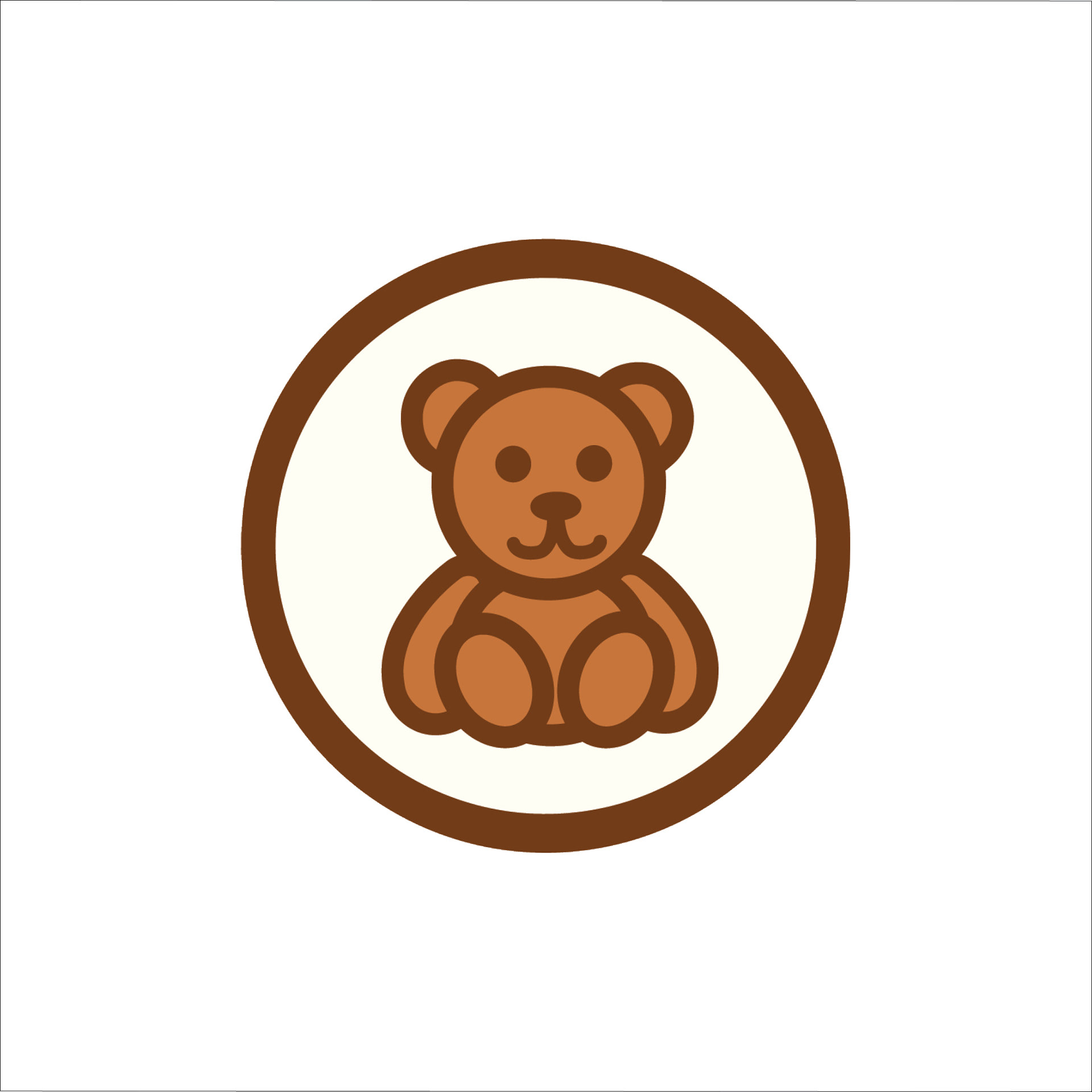
Mockups
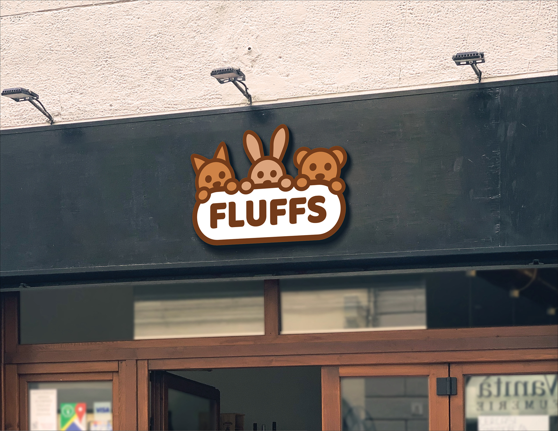
Front of a store with the primary logo

Sticker of the digital icon